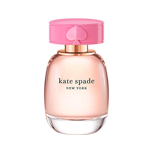
Kate Spade is a famous fashion brand known for its stylish and elegant designs. The brand’s logo is instantly recognizable and plays a crucial role in creating its distinct identity. One essential element of the Kate Spade logo is its font.
The font used in the Kate Spade logo is a custom-designed typeface that has been exclusively created for the brand. This unique font embodies the essence of Kate Spade’s sophisticated and whimsical style.
Characterized by clean lines, playful curves, and a touch of femininity, the font perfectly complements the brand’s aesthetic. Its boldness and elegance make it instantly eye-catching and memorable.
While the exact name of the font remains undisclosed, it is clear that it is a custom typeface created solely for Kate Spade. This exclusivity adds to the brand’s appeal and reinforces its commitment to maintaining a distinct and cohesive visual identity.
Top Fonts Used by Kate Spade
Kate Spade is known for its stylish and modern branding, and the choice of fonts plays a crucial role in maintaining that aesthetic. Here are some of the top fonts used by Kate Spade:
1. Mrs Eaves
Mrs Eaves is a classic serif font that exudes elegance and sophistication. Its clean lines and letterforms make it ideal for headings and larger text blocks on Kate Spade’s website and marketing materials.
2. Brandon Grotesque
Brandon Grotesque is a sans-serif font that is often used for body copy and smaller text sizes. Its versatility and legibility make it a popular choice for Kate Spade’s product descriptions and other text-heavy areas.
In addition to these primary fonts, Kate Spade also incorporates other typefaces and custom fonts to create a unique and cohesive brand identity. These fonts help to convey the brand’s playful and feminine personality.
Disclaimer: This article is for informational purposes only. The fonts mentioned may be subject to change by Kate Spade.
Elegant and Sophisticated Fonts
Choosing the right font is crucial when it comes to creating an elegant and sophisticated design. Fonts can convey different emotions and set the tone for your brand or project. In this article, we will explore a few fonts that are known for their elegance and sophistication.
1. Adobe Caslon Pro
Adobe Caslon Pro is a classic serif font that exudes elegance. Its beautiful curves and tall x-height make it perfect for projects that require a touch of traditional sophistication. This font is often used in high-end fashion magazines and luxury brand logos.
2. Baskerville
Baskerville is another timeless font that is widely regarded for its elegance. With its delicate serifs and clean lines, Baskerville is a versatile choice for both print and digital designs. It is often used in luxury advertisements and high-end book covers.
These are just a few examples of elegant and sophisticated fonts. When choosing a font for your project, consider the overall aesthetic and message you want to convey. Experiment with different fonts to find the one that best represents your brand or project’s personality.
Playful and Whimsical Fonts
Playful and whimsical fonts can add a touch of fun and lightheartedness to any design project. These types of fonts are often characterized by their unique and unconventional letterforms, which help to convey a joyful and energetic atmosphere. Whether you’re working on a children’s book, a party invitation, or a creative logo, these fonts can help express your creative vision.
Here are a few examples of playful and whimsical fonts that you might consider for your next project:
|
1. Cartoonist |
Cartoonist is a bouncy and lively font that’s reminiscent of hand-drawn comic strips. Its uneven letterforms and playful curves give it a charming and approachable feel. |
|
2. Bubblegum Sans |
Bubblegum Sans is a bubbly and friendly font that exudes a sense of cheerfulness. Its rounded letterforms and bright colors make it perfect for youthful and upbeat designs. |
|
3. Comic Neue |
Comic Neue is a modern twist on the classic comic sans font. It maintains the playful and informal feel of the original, but with a more refined and legible appearance. |
|
4. Lemon Tuesday |
Lemon Tuesday is a quirky and whimsical font that’s full of personality. Its outlandish letterforms and bold strokes make it perfect for eye-catching headlines and attention-grabbing designs. |
These are just a few examples of the many playful and whimsical fonts that are available. Remember to choose a font that complements the overall design and message of your project. Have fun experimenting and let your imagination run wild!
Timeless and Classic Fonts
Choosing the right font is crucial when it comes to creating a timeless and classic design. Fonts have the power to evoke emotions and set the tone for a brand or project. Here are some timeless and classic fonts that have stood the test of time:
1. Helvetica
Helvetica is a versatile and widely used sans-serif font that has been around since the 1950s. Its clean and simple design makes it a popular choice for both print and digital mediums. Helvetica is known for its neutral and modern appearance, making it a timeless font option.
2. Garamond
Garamond is a classic serif font that dates back to the 16th century. Its elegant and graceful letterforms make it a popular choice for formal documents and high-end brands. Garamond is often associated with sophistication and tradition, making it a timeless font choice for many designers.
3. Baskerville
Baskerville is another classic serif font that exudes elegance and refinement. It was designed in the 18th century and is known for its high contrast and sharp serifs. Baskerville is often used in editorial designs and is a popular choice for book covers and titles.
4. Futura
Futura is a geometric sans-serif font that was introduced in the 1920s. Its clean and modern design makes it a popular choice for minimalist and contemporary designs. Futura has a timeless appeal and is often used in logos, headlines, and branding materials.
5. Times New Roman
Times New Roman is a classic serif font that has been widely used since its creation in the 1930s. Its readability and familiarity make it a popular choice for body text in printed materials and documents. Times New Roman is often associated with professionalism and is a timeless font option for formal settings.
When choosing a font for your project, consider the overall style and message you want to convey. These timeless and classic fonts can help you create designs that stand the test of time and never go out of style.
Modern and Chic Fonts
When it comes to creating a modern and chic design, choosing the right font is crucial. Fonts can greatly affect the overall look and feel of your design, and can help convey the message or brand identity you want to portray. Here are a few fonts that are commonly used in modern and chic designs:
1. Gotham
Gotham is a popular choice for modern designs due to its clean and minimalist look. It has a geometric feel and is often used in branding and web design. Gotham is known for its versatility and can be used in various sizes and weights.
2. Futura
Futura is a classic font that has stood the test of time. Its clean and simple lines make it a great choice for modern designs. Futura is commonly used in headlines, logos, and posters, and its wide range of weights and styles allows for a lot of creativity.
Note: The font used by Kate Spade may not be publicly available or known. It is possible that they use a custom or exclusive font for their branding and designs.
Remember, when choosing a font for your modern and chic design, it’s important to consider factors such as readability, legibility, and the overall aesthetic you want to achieve. Experiment with different fonts and combinations to find the perfect fit for your project!
Bold and Statement-Making Fonts
When it comes to creating a bold and memorable brand identity, the font choice plays a crucial role. Kate Spade, a renowned fashion brand, understands the power of typography in making a statement.
One notable font that Kate Spade uses in its branding is the Didoni font. This elegant and bold font adds a touch of sophistication to the brand’s logo and marketing materials. The Didoni font features tall and thin letterforms with intricate details, making it a perfect choice for creating a luxurious and high-end feel.
In addition to the Didoni font, Kate Spade also employs other fonts with strong and bold characteristics. The Bodoni font, known for its distinctive thick and thin strokes, is often used to create a powerful and attention-grabbing headline. This font adds a sense of confidence and elegance to the brand’s messaging.
The brand also incorporates the Futura font in its designs. The clean and geometric shapes of this font give a modern and sleek look to Kate Spade’s brand materials. It is often used for providing clarity and conciseness in the brand’s messaging.
In summary, the fonts used by Kate Spade are carefully selected to convey a specific sentiment and make a bold statement. The Didoni font adds a touch of sophistication, the Bodoni font exudes confidence and elegance, while the Futura font provides a modern and sleek look. Together, these fonts contribute to the distinctive and memorable brand identity of Kate Spade.


